In Tkinter (and most GUI libraries), widget is the name given to a component of the GUI that the user can interact with. User interfaces are made up of multiple widgets arranged within the window to make it functional and intuitive to use.
Tkinter comes with a decent set of widgets and even allows you to create your own custom widgets or customize existing ones.
A Quick Demo
First, let's have a look at some of the most common Tkinter widgets. The following code creates a range of Tkinter widgets and adds them to a window layout so you can see them together:
import tkinter as tk
from tkinter import ttk

root = tk.Tk()
root.title("Widgets Demo")

widgets = [
    tk.Label,
    tk.Checkbutton,
    ttk.Combobox,
    tk.Entry,
    tk.Button,
    tk.Radiobutton,
    tk.Scale,
    tk.Spinbox,
]

for widget in widgets:
    try:
        widget = widget(root, text=widget.__name__)
    except tk.TclError:
        widget = widget(root)
    widget.pack(padx=5, pady=5, fill="x")

root.mainloop()
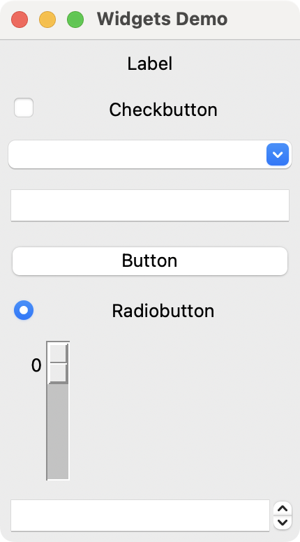 Tkinter's Widgets Demo on macOS
You can learn how the pack() geometry manager works in our Using the Pack Geometry Manager in Tkinter tutorial.
Let's have a look at all the example widgets, from top to bottom:
| Widget | Description |
|---|---|
Label |
Just a label, not interactive |
Checkbutton |
A checkbox |
Combobox |
A dropdown list box |
Entry |
Enter a line of text |
Button |
A button |
Radiobutton |
A toggle set, with only one active item |
Scale |
A slider |
Spinbox |
An integer spinner |
There are a few more widgets in Tkinter, but they don't fit so well for a quick demo example! You can see them all by checking the TkDocs.
Now, we'll step through each of those widgets in turn, adding them to our application and seeing how they behave.
Label
We'll start the tour with Label, arguably one of the simplest widgets available in the Tkinter toolbox. This is a simple one-line piece of text that you can position in your application. You can set the text by passing in a str as you create it:
label = tk.Label(self, text="Hello")
Or, by using the .config() function:
label = tk.Label(self, text="1")  # The label is created with the text 1.
label.config(text="2")   # The label now shows 2.
You can also adjust font properties, such as the family and size. Here's an app that showcases these features:
import tkinter as tk

root = tk.Tk()
root.title("Tkinter Label")
root.geometry("200x80")

label = tk.Label(root, text="Hello!", font=("Helvetica", 30))
label.pack(expand=True)

root.mainloop()
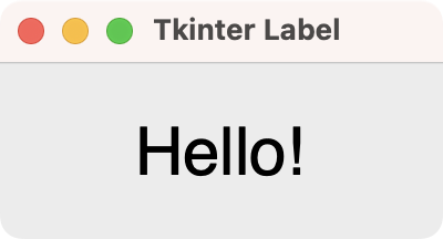 Tkinter's Label Widget on macOS
Note that if you want to change the properties of a widget font, it is usually better to set the font when creating the widget to ensure consistency.
The alignment is specified by using the anchor configuration option. The possible horizontal text alignments are:
| Option | Behavior |
|---|---|
"w", tk.W (for West) |
Aligns with the left edge |
"e", tk.E (for East) |
Aligns with the right edge |
"center", tk.CENTER |
Centers horizontally in the available space |
The options available for vertical alignment are:
| Option | Behavior |
|---|---|
"n", tk.N (for North) |
Aligns with the top |
"s", tk.S (for South) |
Aligns with the bottom |
"center", tk.CENTER |
Centers vertically in the available space |
You can combine these by setting the anchor option:
label = tk.Label(self, text="Hello", anchor="center")
Note that you use the anchor option to combine the alignment settings.
Finally, you can also use Label to display an image using PhotoImage. This function accepts an image file, and you can create it as follows:
import tkinter as tk

root = tk.Tk()
root.title("Tkinter Label Image")

photo = tk.PhotoImage(file="otje.png").subsample(2)
label = tk.Label(root, image=photo)
label.pack(expand=True)

root.mainloop()
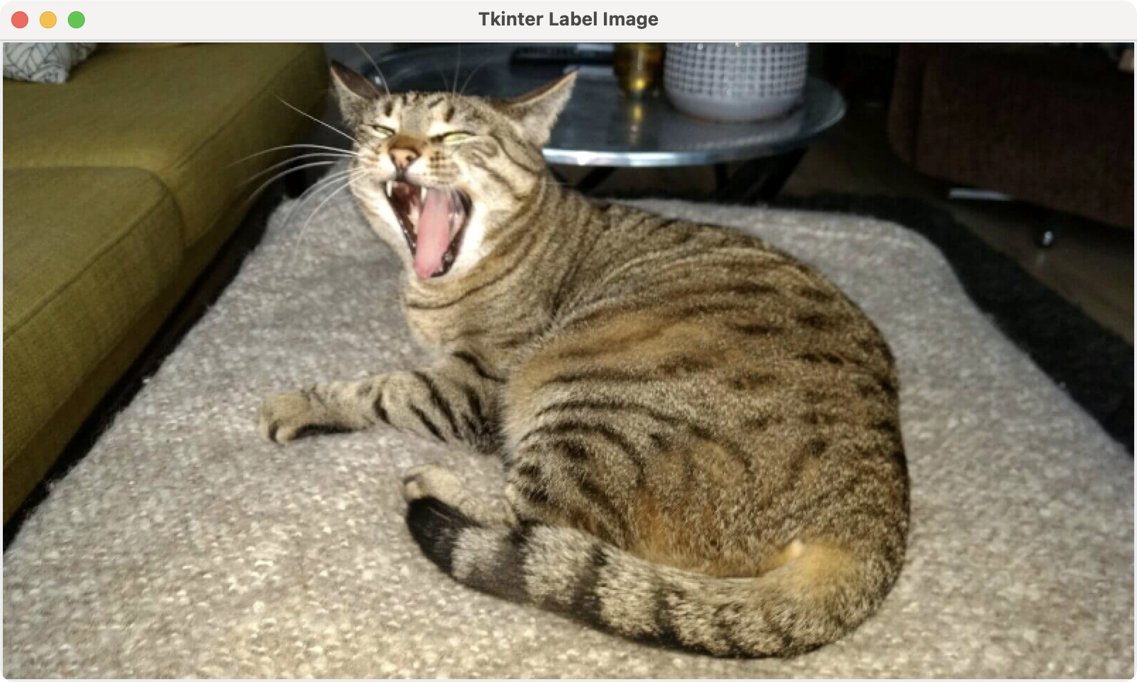 Otje, the cat, displayed in a window
What a lovely face!
Button
The Button widget is one of the most commonly used widgets in Tkinter. It represents a clickable button that can trigger an action when pressed. We typically use buttons for submitting forms, opening dialogs, or starting processes.
Here's a simple example:
import tkinter as tk

root = tk.Tk()
root.title("Tkinter Button")
root.geometry("200x100")

def on_click():
    label.config(text="Button clicked!")

button = tk.Button(
    root,
    text="Click Me",
    command=on_click,
)
button.pack(padx=5, pady=5)

# A helper label to show the result of the click
label = tk.Label(root, text="Waiting for click...")
label.pack(padx=5, pady=5)

root.mainloop()
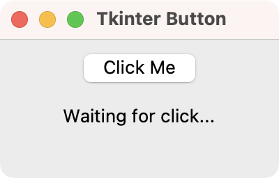 Tkinter's Button Widget on macOS
In this example, you create a button with the label "Click Me". The command argument connects the button to the on_click() function, which updates the label's text when we click the button.
You can customize the button by adjusting its width, height, font, bg (background color), and fg (foreground/text color). For example:
button = tk.Button(
    root,
    text="Styled Button",
    bg="blue",
    fg="white",
    font=("Arial", 14)
)
Buttons are versatile and form the backbone of interactive Tkinter applications.
Checkbutton
The next widget to explore is Checkbutton. As its name suggests, it presents a checkable box to the user. As with all Tkinter widgets, it has a number of configuration options to change the widget behaviors:
import tkinter as tk

root = tk.Tk()
root.title("Tkinter Checkbutton")
root.geometry("210x80")

def show_state():
    checked = "Checked" if var.get() else "Unchecked"
    checkbox.config(text=f"Check me! ({checked})")

var = tk.IntVar()
checkbox = tk.Checkbutton(root, text="Check me! (Checked)", variable=var)
checkbox.select()
checkbox.config(command=show_state)
checkbox.pack(padx=5, pady=10)

root.mainloop()
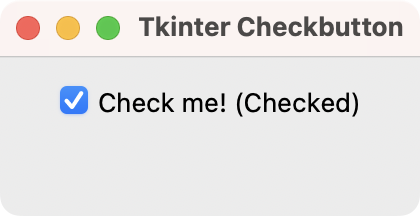 Tkinter's Checkbutton Widget on macOS
You can programmatically set a checkbox state using select() or deselect(). You can access the state using a tk.IntVar() variable, which holds the checkbox's state: 1 for checked and 0 for unchecked.
Combobox
The Combobox widget is a drop-down list, closed by default with an arrow to open it. You can select a single item from the list, and the currently selected item is shown as a label on the widget. The combo box is suited to selecting a choice from a long list of options.
You can add items to a Combobox by passing a list of strings to its values argument. The items will be added in the order we provide them:
import tkinter as tk
from tkinter import ttk

root = tk.Tk()
root.title("Tkinter Combobox")
root.geometry("200x80")

def selection_changed(event):
    label.config(text=f"{event.widget.get()} selected!")

combobox = ttk.Combobox(root, values=["One", "Two", "Three"])
combobox.set("One")
combobox.bind("<<ComboboxSelected>>", selection_changed)
combobox.pack(padx=5, pady=5, fill="x")

# A helper label to show the selected value
label = tk.Label(root, text="One selected!")
label.pack(padx=5, pady=5, fill="x")

root.mainloop()
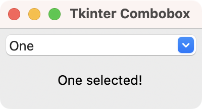 Tkinter's Combobox Widget on macOS
In this example, we create a combo box whose values come from a Python list. Then, we set the current value to "One" with the set() function.
The bind() function connects the <<ComboboxSelected>> event to the selection_changed() function. This event is triggered when the currently selected item changes. The function updates the text of the helper label to reflect the selected item.
Combobox widgets can also be editable, allowing users to enter values not currently in the list. To achieve this, you need to set the state argument to "normal":
widget.config(state="normal")
You can also set a limit to the number of items allowed by configuring the list or using custom validation.
Listbox
The Listbox widget is similar to Combobox, except that its options are presented as a scrollable list of items. It also supports the selection of multiple items at once. The Listbox class offers a <<ListboxSelect>> event that sends the selected item's index:
import tkinter as tk

root = tk.Tk()
root.title("Tkinter Listbox")

def selection_changed(event):
    selection = event.widget.curselection()
    if selection:
        index = selection[0]
        label.config(text=f"{event.widget.get(index)} selected!")
        event.widget.get(index)

listbox = tk.Listbox(root)
for item in ["One", "Two", "Three"]:
    listbox.insert(tk.END, item)
listbox.bind("<<ListboxSelect>>", selection_changed)
listbox.pack(padx=5, pady=5, fill="both", expand=True)

# A helper label to show the selected value
label = tk.Label(root, text="One selected!")
label.pack(padx=5, pady=5, fill="x")

root.mainloop()
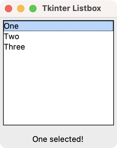 Tkinter's Listbox Widget on macOS
In this example, you create a list box and populate it through a for loop and the insert() function. Then, you connect the "<<ListboxSelect>>" event with the selection_changed() function. The helper label at the bottom of the window shows the selected item.
Entry
The Entry widget is a simple single-line text editing box, into which users can type input. These are used for form fields, or settings where there is no restricted list of valid inputs. For example, when entering an email address or computer name:
import tkinter as tk

root = tk.Tk()
root.title("Tkinter Entry")

def return_pressed(event):
    label.config(text=event.widget.get())

entry = tk.Entry(root)
entry.insert(0, "Enter your text")
entry.bind("<Return>", return_pressed)
entry.pack(padx=5, pady=5, fill="x")

# A helper label to show the selected value
label = tk.Label(root, text="Entry demo!")
label.pack(padx=5, pady=5, fill="x")

root.mainloop()
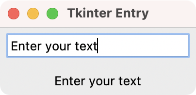 Tkinter's Entry Widget on macOS
In this example, you create a text entry using the Entry widget. Then, you insert a placeholder text using the insert() function. The Entry widget allows you to handle various text events, including when the Return key is pressed. Binding this even to return_pressed() ensures that when you press Enter, the helper label displays the text that you type into the entry.
The Entry class has several useful features. They even allow you to perform input validation using custom validation functions and regular expressions.
Spinbox
The Spinbox widget provides an input box for numerical values. It has arrows to increase and decrease the value. It supports integers natively:
import tkinter as tk

root = tk.Tk()
root.title("Tkinter Spinbox")
root.geometry("200x80")

spinbox_var = tk.StringVar(value="0")
spinbox = tk.Spinbox(
    root,
    from_=-10,
    to=10,
    textvariable=spinbox_var,
)
spinbox.pack(padx=5, pady=5, fill="x")

# A helper label to show the selected value
label = tk.Label(root, textvariable=spinbox_var)
label.pack(padx=5, pady=5, fill="x")

root.mainloop()
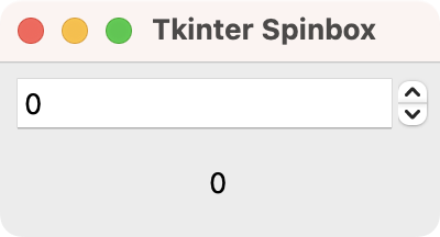 Tkinter's Spinbox Widget on macOS
The code above shows the various features available for the Spinbox widget. You can set the interval extremes with the from_ and to arguments. In practice, you'll often use the textvariable option to control the spin box value.
Scale
The Scale widget provides a slide-bar widget that works much like a Spinbox. Rather than displaying the current value numerically, it displays the position of the slider handle along the length of the widget.
This widget is often useful when we need to adjust between two extremes but where absolute accuracy is not required. The most common use of this type of widget is for volume controls in multimedia apps:
import tkinter as tk

root = tk.Tk()
root.title("Tkinter Scale")
root.geometry("200x80")

def value_changed(event):
    label.config(text=event.widget.get())

scale = tk.Scale(root, from_=0, to=10, orient="horizontal")
scale.bind("<Motion>", value_changed)
scale.pack(padx=5, pady=5, fill="x")

# A helper label to show the selected value
label = tk.Label(root, text="0")
label.pack(padx=5, pady=5, fill="x")

root.mainloop()
Run this and you'll see a slider widget. Drag the slider to change the value.
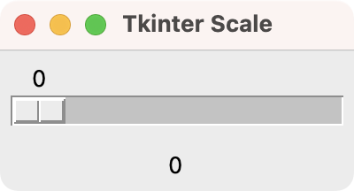 Tkinter's Scale Widget on macOS
You can also construct a slider with a vertical or horizontal orientation by setting the orient option.
Conclusion
This concludes our brief tour of the common widgets used in Tkinter applications. To see the full list of available widgets, including all their options and attributes, take a look at the Tkinter Documentation or TkDocs site.
Bring Your PyQt/PySide Application to Market
Stuck in development hell? I'll help you get your project focused, finished and released. Benefit from years of practical experience releasing software with Python.