In the previous tutorials we've taken the first steps building apps with Tkinter, creating windows and adding simple label and button widgets. We've also looked at geometry managers for laying out widgets in a window.
In this tutorial, we'll focus on two more commonly used Tkinter widgets – Checkbutton and Radiobutton. These inputs are clickable widgets with which you can present options for users to select. Check buttons let you select multiple choices, while radio buttons allow a unique option.
Creating a Checkbutton Widget
Checkbuttons (also called checkboxes) are simple widgets which can be checked and unchecked by the user. They are commonly used for switching features (or behavior) on and off in settings panels, or for selecting items from a list of choices. When checked a checkbox is considered "on" and when unchecked it is "off". Different checkboxes should behave independently of one another, although sometimes you may want to enable/disable some checkboxes based on the state of another.
When toggled Checkbutton widgets can call methods or functions using the command argument. The current state of a Checkbutton is stored in an external control variable. Control variables are created using Tkinter's variable classes, such as IntVar, DoubleVar, BooleanVar, and StringVar. The linked control variable will be updated to reflect any changes in the widget.
Let's take a look at a basic app that sets up a Checkbutton widget:
import tkinter as tk

root = tk.Tk()
root.title("Checkbutton")
root.geometry("200x100")

def select_items():
    label.config(text=f"Selected: {bool(variable.get())}")

variable = tk.IntVar()
item = tk.Checkbutton(
    root,
    text="Tuna fish",
    command=select_items,
    variable=variable,
)
item.pack(anchor="w", padx=10, pady=10)

label = tk.Label(root, text="Selected: False")
label.pack(
    anchor="w",
    padx=10,
    pady=10,
)

root.mainloop()
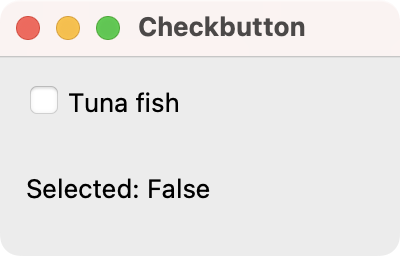
In this example, the main window contains a Checkbutton labeled "Tuna fish" and a Label that displays whether the checkbox is selected. The state of the Checkbutton is linked to a tk.IntVar variable, which stores 1 when the button is checked and 0 when unchecked.
When you select and unselect the check button, the select_items() function is called, updating the Label to show the selection status (True or False) based on the value of the variable.
Save the code as app.py and run it as for any other Python script.
python app.py
You'll see the following window:
 Tkinter demo app showing a Check button
Creating a Radiobutton Widget
Whereas the Checkbutton widgets are useful for selecting several choices, the Radiobutton widget is used for picking one choice out of many.
To achieve exclusivity among the radio buttons in a group, they must share the same variable. This means that when one radio button in a group is selected any other selected widgets will be deselected.
Here's an example demonstrating how to use Radiobutton widgets:
import tkinter as tk

root = tk.Tk()
root.title("Radiobutton")
root.geometry("180x240")

countries = ["USA", "France", "Germany", "Sweden", "Brazil"]

label = tk.Label(
    root,
    text=f"Selected: {countries[0]}",
)
label.pack(anchor="w", padx=10, pady=10)

def selection():
    label.config(text=f"Selected: {variable.get()}")

variable = tk.StringVar(root, f"{countries[0]}")

for country in countries:
    tk.Radiobutton(
        root,
        text=country,
        variable=variable,
        value=country,
        command=selection,
    ).pack(anchor="w", padx=10, pady=5)

root.mainloop()
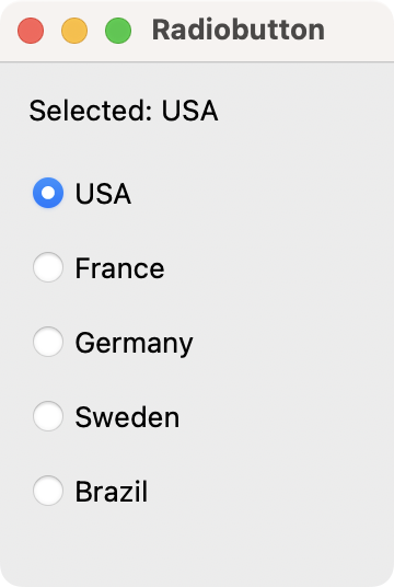
In this code, we create a Label that shows the currently selected country, initialized to "USA". A StringVar variable stores the selected value among a list of countries.
Then, you start a loop to generate a Radiobutton widget for each country, binding its value to the corresponding country name. When you select a given Radiobutton, the selection() function updates the Label to display the new selection.
You can see how the radio button group looks in the following screenshot:
 Tkinter demo app showing a Radio button group
As you can see, the process for creating radio buttons is similar to check buttons. However, we need one additional argument called value associated with each individual radio button. If you have a bunch of radio button widgets you need to create, try using a for loop to instantiate them.
Building a Demo Food Ordering GUI
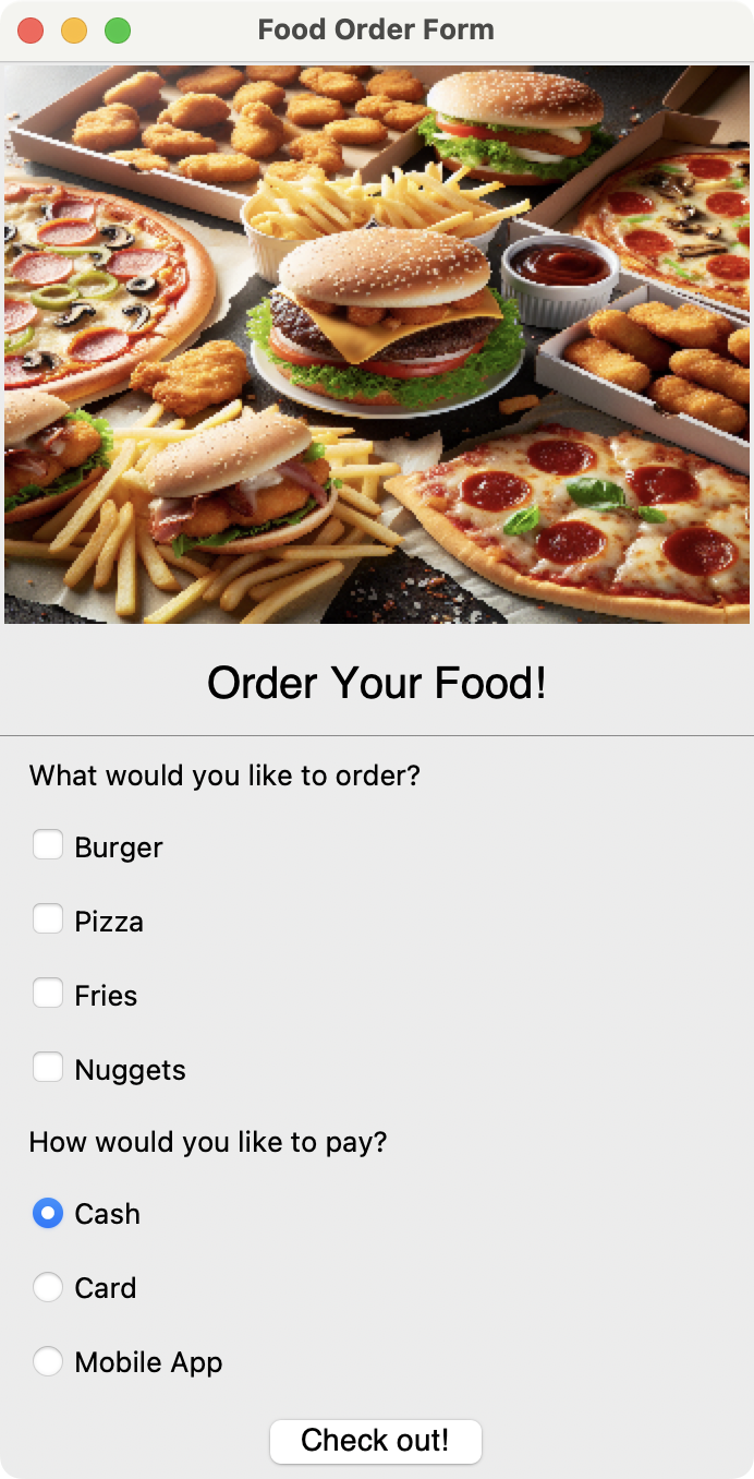
Now let's take code an example that combines Checkbutton and Radiobutton widgets to create a food ordering form that will look something like the following:
 Food ordering form
Here's the code for our demos app:
import tkinter as tk
from tkinter import messagebox, ttk

class FoodOrderingApp(tk.Tk):
    def __init__(self):
        super().__init__()
        self.title("Food Order Form")
        self.foods_list = ["Burger", "Pizza", "Fries", "Nuggets"]
        self.payment_methods = ["Cash", "Card", "Mobile App"]
        self.setup_header()
        self.setup_foods()
        self.setup_payment()

    def setup_header(self):
        self.image = tk.PhotoImage(file="food.png").subsample(3, 4)
        tk.Label(self, image=self.image).pack()
        tk.Label(
            self,
            text="Order Your Food!",
            font=("Helvetica", 20),
            bd=10,
        ).pack()
        line = ttk.Separator(self, orient=tk.HORIZONTAL)
        line.pack(fill="x")
        order_label = tk.Label(self, text="What would you like to order?")
        order_label.pack(anchor="w", padx=10, pady=5)

    def setup_foods(self):
        for food_item in self.foods_list:
            var = tk.IntVar()
            self.__dict__[food_item] = tk.Checkbutton(
                self, text=food_item, variable=var
            )
            self.__dict__[food_item].var = var
            self.__dict__[food_item].pack(anchor="w", padx=10, pady=5)

    def setup_payment(self):
        payment_label = tk.Label(
            self,
            text="How would you like to pay?",
        )
        payment_label.pack(anchor="w", padx=10, pady=5)

        self.var = tk.IntVar()
        self.var.set(0)

        for value, method in enumerate(self.payment_methods):
            tk.Radiobutton(
                self,
                text=method,
                variable=self.var,
                value=value,
            ).pack(anchor="w", padx=10, pady=5)

        next_button = tk.Button(
            self,
            text="Check out!",
            command=self.print_results,
            font=("Helvetica", 14),
        )
        next_button.pack(padx=10, pady=5)

    def print_results(self):
        msg = ""
        for food_name in self.foods_list:
            food_button = getattr(self, food_name)
            if food_button.var.get() == 1:
                msg += f"Item selected: {food_button['text']}\n"

        index = self.var.get()
        msg += f"Payment method: {self.payment_methods[index]}"
        messagebox.showinfo("Order Summary", msg)

if __name__ == "__main__":
    app = FoodOrderingApp()
    app.mainloop()
In this example, we use the Checkbutton widgets to allow users to select multiple food items from a predefined list of foods. Each Checkbutton is linked to an IntVar variable to track its selection state (1 for selected, 0 for unselected). We display the check buttons vertically, aligned to the left (anchor="w"), with padding for spacing (padx=10, pady=5).
The Radiobutton widgets enable the user to select a single payment method from a list of possibilities. The Radiobutton widgets are linked to a shared IntVar variable (self.var). This ensures that only one button can be active at a time, reflecting the mutually exclusive nature of the payment options. The Radiobutton widgets are also packed vertically with padding and alignment to the left for consistent layout.
When the user clicks the Check out! button, the print_results() method is called, gathering the selected items and the chosen payment method. The results are then displayed in a messagebox for user confirmation.
Summary
In this tutorial, we took a quick look at the Checkbutton and Radiobutton widgets. These two types of widgets are useful for allowing a user to select choices from a group of options. Check buttons are used when a user needs to select multiple options, while radio buttons are used when a user only needs to select one choice from many.
You will now be able to add selectable options to your own applications.

Packaging Python Applications with PyInstaller by Martin Fitzpatrick
This step-by-step guide walks you through packaging your own Python applications from simple examples to complete installers and signed executables.
